AIRVISA — Improving a B2C Multilingual Visa Application Service to Boost Conversion
In this project, I focused on improving a B2C multilingual visa application service at AIRVISA. By analyzing user behavior through both quantitative data and qualitative insights, I identified key drop-off points and led UI improvements to optimize the overall user experience and increase conversion.
Project Overview
My Role
Product Designer
Teammates
1 Project Manager, 3 Developers, 1 Designer
Platform
Mobile
Timeline
December 2024 – January 2025
Project Background
AIRVISA is an early-stage startup with the mission of eliminating unreasonable immigration procedures in Japan and helping build a more diverse and inclusive society. The company offered a B2C online visa application service for foreign residents in Japan, but from a business growth perspective, revenue was not meeting expectations.
My goal was to contribute to both product and business improvement by creating a smoother, more intuitive application experience through UI improvements. To achieve this, I combined quantitative behavior analysis using Microsoft Clarity with detailed observation of user session recordings, and led the process end-to-end—from extracting insights and forming improvement hypotheses to redesigning the UI and validating the impact.
Design Process
1. Research — Identifying Improvement Opportunities
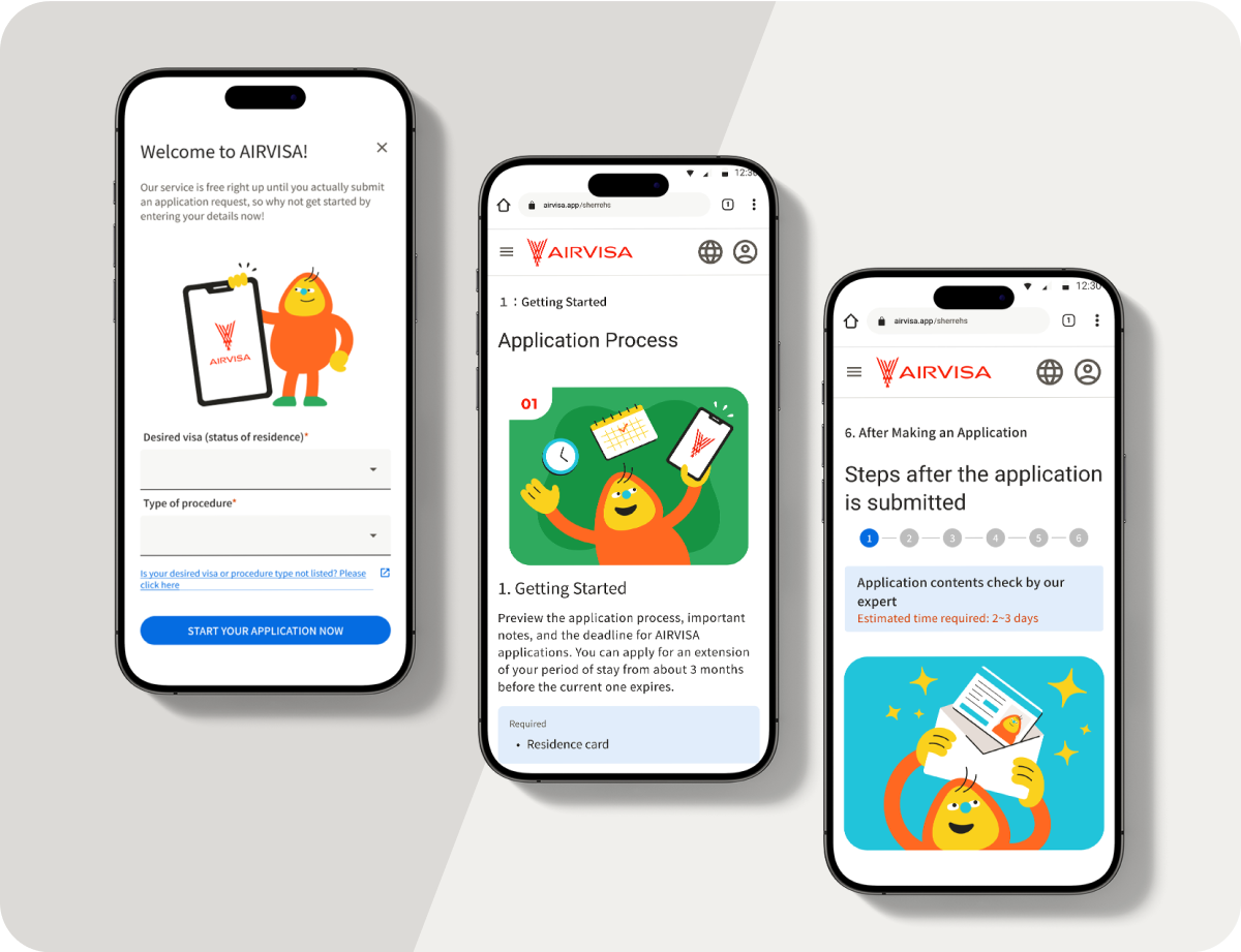
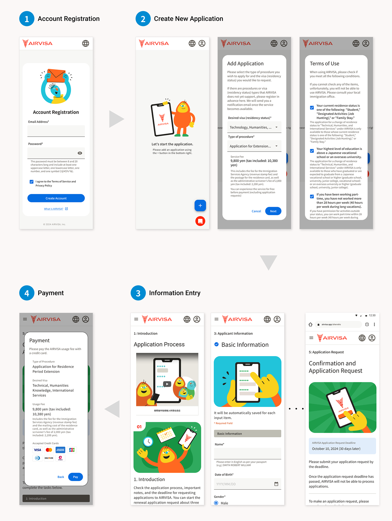
The AIRVISA application flow consists of four main steps:
1. Account creation
2. Creating a new application
3. Entering required information
4. Submitting the application request
By analyzing user behavior with Microsoft Clarity, I found that the drop-off rate at Step 2—creating a new application—was unusually high at 53%. This insight made it clear that improving this step was the highest priority, so all later iterations focused on reducing drop-offs and helping users move forward more smoothly.
2. Research — Understanding the Root Causes
To understand why users were dropping off at Step 2, I closely analyzed user session recordings in Microsoft Clarity. Based on observed behaviors, I identified two key hypotheses that were likely contributing to the drop-offs.
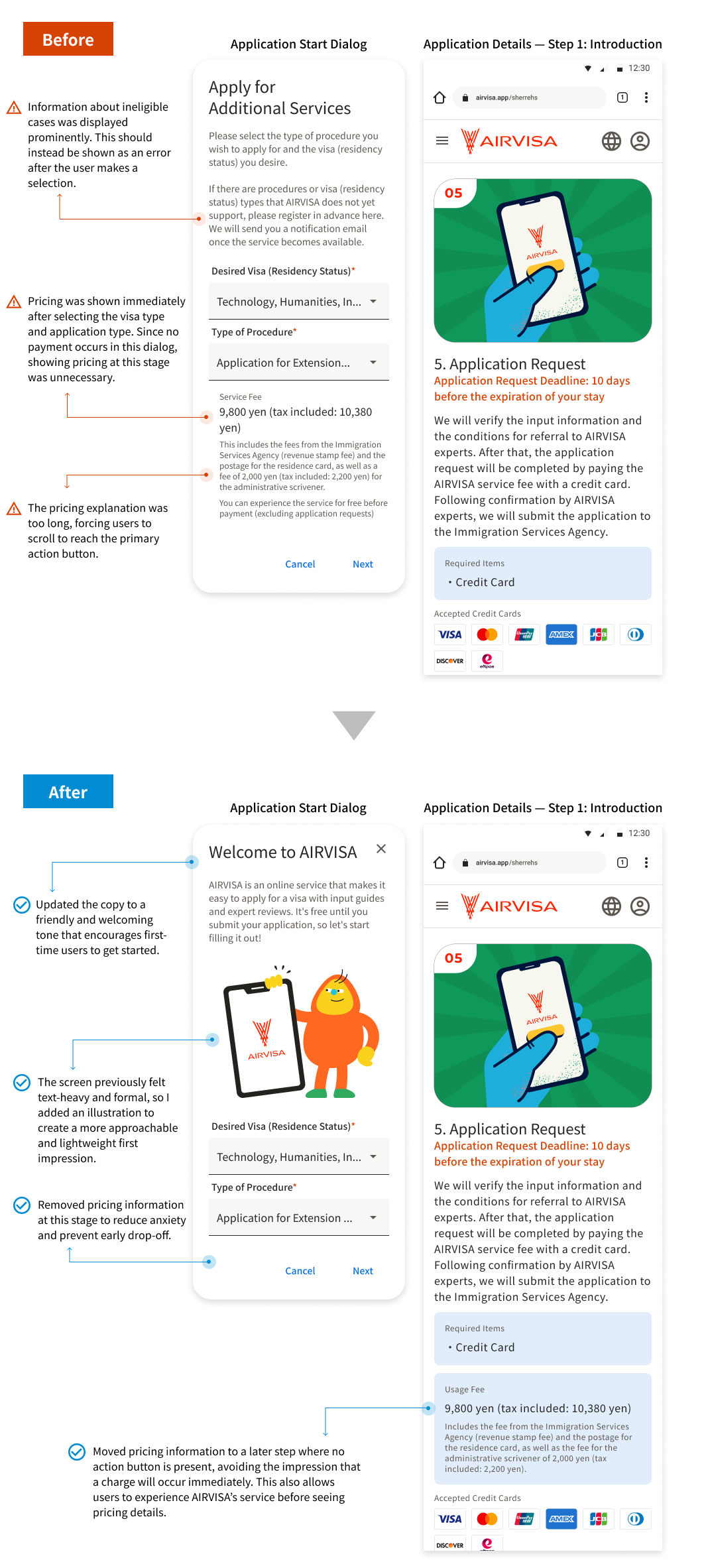
Although no payment was required at this stage, many users dropped off when pricing information appeared. The sudden display of price details seemed to raise concerns such as, “Am I being charged here?” This was especially true for first-time users, for whom the pricing display created a psychological barrier and hesitation to proceed to the next step.

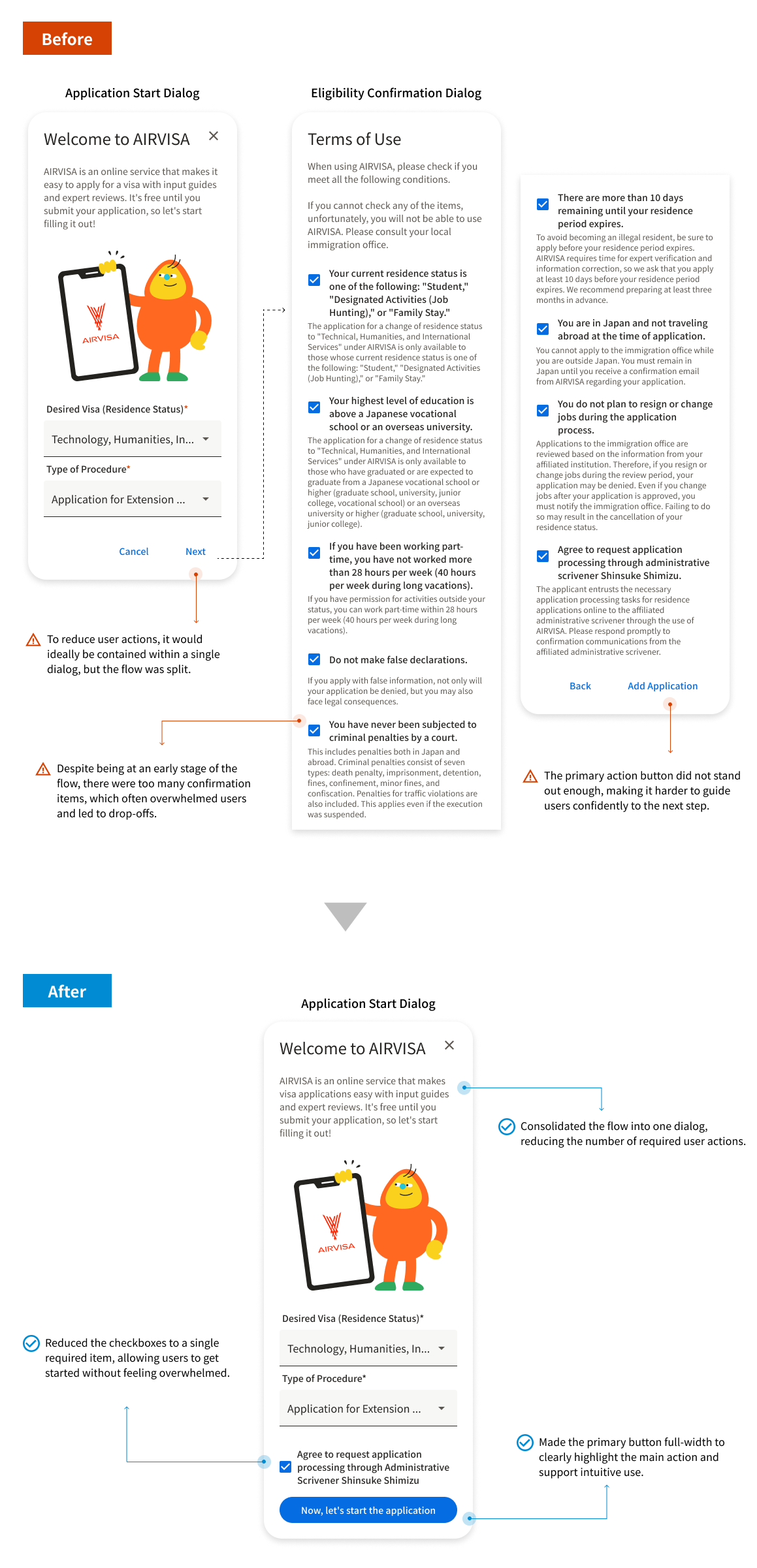
Another major drop-off point occurred when users encountered the eligibility checkboxes. The large number of items and the formal wording made the process feel difficult and burdensome. This created a psychological hurdle, leading users to pause or abandon the flow instead of moving forward.
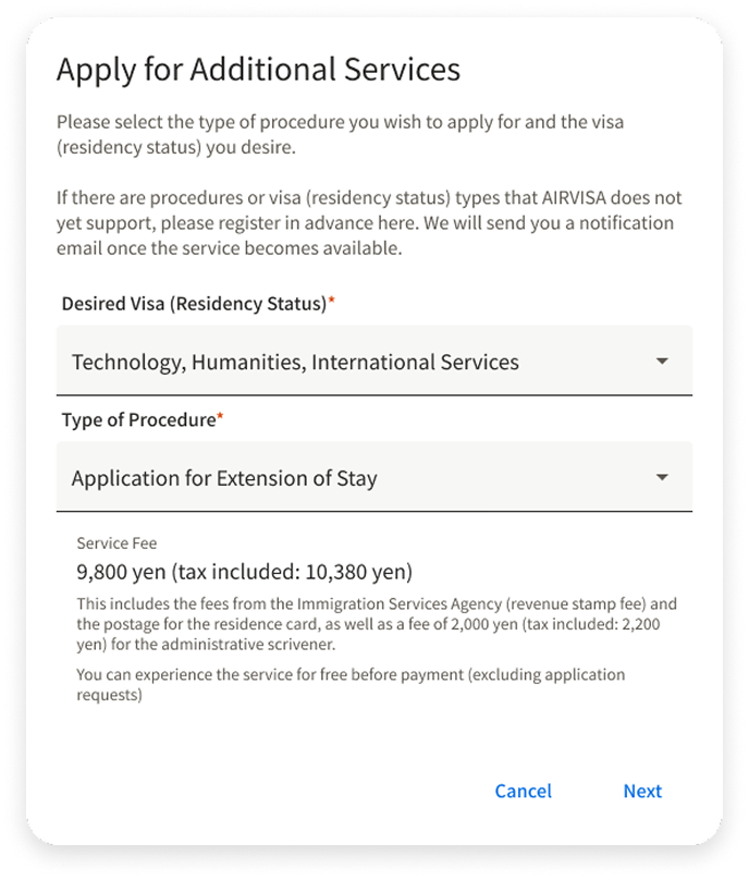
3. First Iteration — Improving Price Display
The first area I focused on was improving how pricing information was presented. Because AIRVISA deals with visa applications, users often feel nervous and cautious when starting the process. My goal was to create an experience where users could feel comfortable trying the application first, without worrying about being charged.
By allowing users to move forward and experience the intuitive UI and helpful guidance, I aimed to reduce anxiety and build confidence before showing pricing details. I believed that once users felt, “I can do this,” they would be more likely to continue the process, rather than dropping off due to concerns about cost.
4. Second Iteration — Improving Eligibility Checkboxes
The next area I focused on was improving the eligibility checkboxes. Originally, this screen displayed nine checkboxes to determine whether users were eligible for online application. The volume of items and the formal wording created a strong psychological burden and were likely a major cause of drop-off.
To address this, I grouped the nine items into four categories and redesigned when and where each group was shown. Instead of presenting everything upfront, I displayed each category at the most appropriate step in the flow. This approach aimed to significantly reduce the sense of pressure users felt at the beginning.
Example:
Highest level of education is university or higher
Timing:
After application creation
Example:
Agree not to provide false information
Timing:
Just before payment
Example:
At least 10 days remaining before visa expiration
Action:
Removed from the checklist and automatically validated by the system
Example:
Agree to request support from a certified scrivener
Timing:
Before application start
With this change, it became possible that some users would realize later in the process that they were not eligible. However, I determined that allowing more users to first experience the service—its intuitive UI and functionality—was more valuable for the business.
As a result, the number of required checks before starting an application was reduced to just one. This significantly lowered the psychological barrier at the initial step and made it much easier for users to get started.
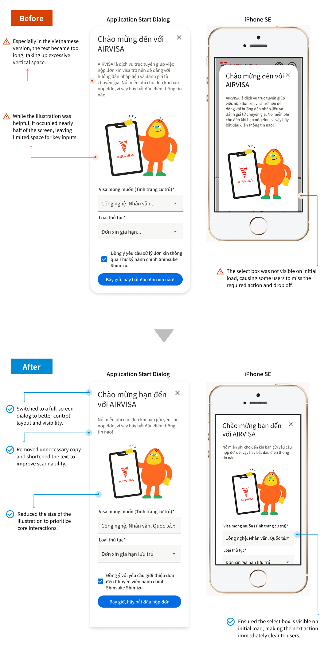
5. Third Iteration — Improving Visibility in Multilingual Views
To evaluate the impact of the earlier changes, I reviewed user behavior again using Microsoft Clarity. In the Vietnamese version, longer text caused key select boxes to be pushed out of view on smaller devices, such as the iPhone SE. As a result, users could not easily recognize what action to take next, which led to additional drop-offs.
To address this issue, I introduced a full-screen dialog to ensure that primary actions and buttons were always visible, regardless of language or device size. I also adjusted text length and illustration sizes to create a layout that remained clear and easy to use in multilingual environments, even on small screens.
Outcomes
Quantitative results showed a clear improvement after the design changes. The drop-off rate at Step 2 (creating a new application) decreased from 53% to 36%.
When focusing on the target users—those with visa expirations within 1 to 3 months—the drop-off rate improved even more significantly, dropping from 47% to 15%.
These results confirmed that the improvements successfully reduced users’ psychological burden and enabled a smoother path to completing application creation.