AIRVISA — Building a B2B SaaS Platform to Streamline HR Visa Management
In this project, I led the design of a B2B SaaS platform for HR teams at AIRVISA, working as the only full-time designer with engineers and a product manager.
I started by focusing on understanding real HR workflows through in-depth user research. This allowed me to translate complex legal and compliance requirements into an intuitive, easy-to-use experience that HR teams could rely on in their daily work.
Project Overview
My Role
Product Designer
Teammates
1 Project Manager, 6 Developers, 1 Designer
Platform
Web / Mobile
Timeline
January 2025 – June 2025
Project Background
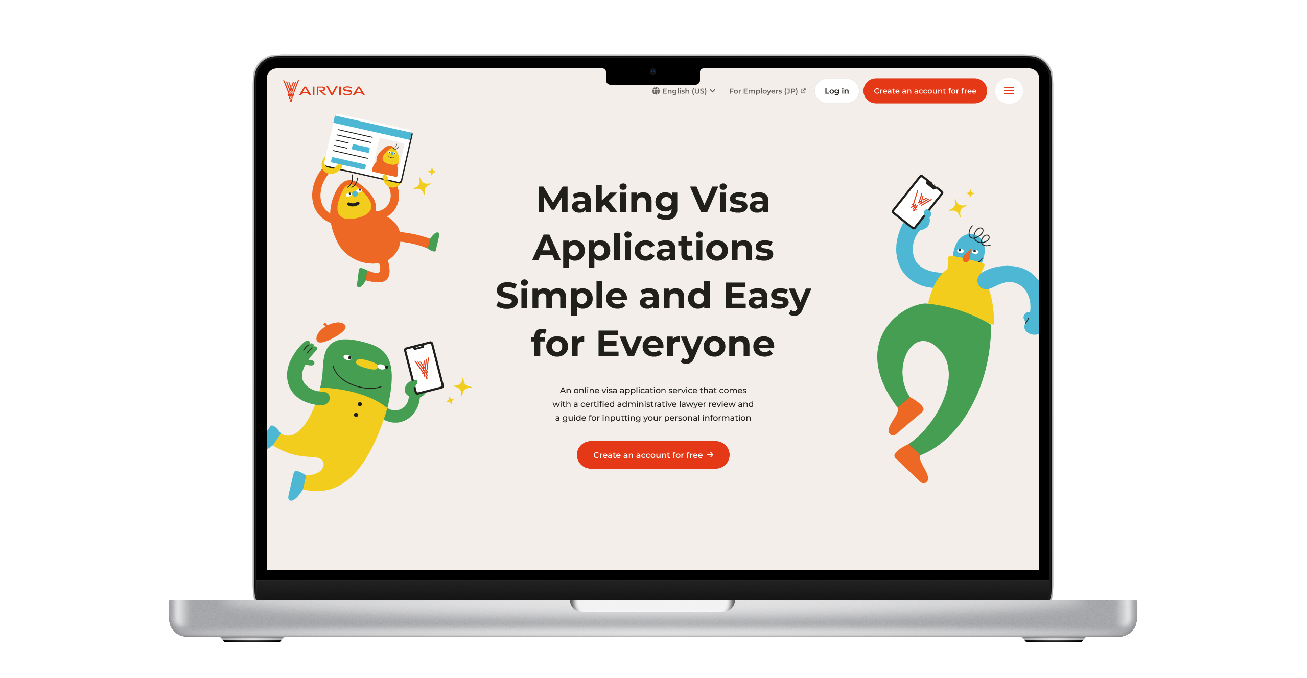
We initially provided a B2C service that enabled foreign residents in Japan to complete their visa applications entirely online, eliminating the need to visit the immigration office. By digitizing the traditionally paper-based process and organizing complex procedures into an intuitive interface, the service achieved high user satisfaction.
However, visa renewal timing varies from person to person, making it difficult to reach users at the exact moment they needed the service. As a result, marketing efficiency was low. Despite strong user satisfaction, business growth fell short of expectations.
Instead of focusing solely on individual applicants, we decided to build a B2B visa management platform for HR teams who regularly manage employee visas. The goal was to leverage HR teams as a distribution channel, enabling them to introduce the service to employees at the right time—when visa renewal was approaching.
Design Process
1. User Interviews
I began by conducting user research. Participants were recruited from our existing customer list, resulting in 15 participants. I conducted one-hour online interviews with each participant, following a structured discussion guide and exploring insights more deeply based on their responses.
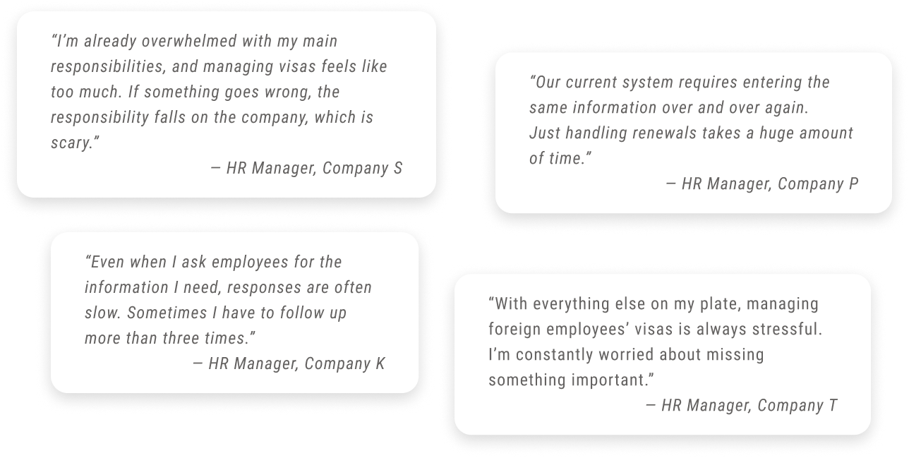
Through this research, I identified four major challenges. It became clear that the product’s core value extended beyond operational efficiency—it also played a critical role in risk mitigation and establishing a trustworthy, reliable system.
Key Challenges in HR Visa Management
Since illegal employment is the company’s responsibility, this was considered a significant business risk.
HR teams are busy with core responsibilities and struggle to find time for visa-related tasks.
Collecting information from employees was time-consuming, with delayed responses and repeated follow-ups.
Many companies relied on spreadsheets, increasing the risk of human error.
2. Personas
Based on user research insights, I drafted personas to guide product development and refined them collaboratively with stakeholders from Customer Support and Sales. Their daily interactions with users provided valuable perspectives on user needs and behaviors. After sharing them with the team, the personas became a common language that guided product and design decisions.
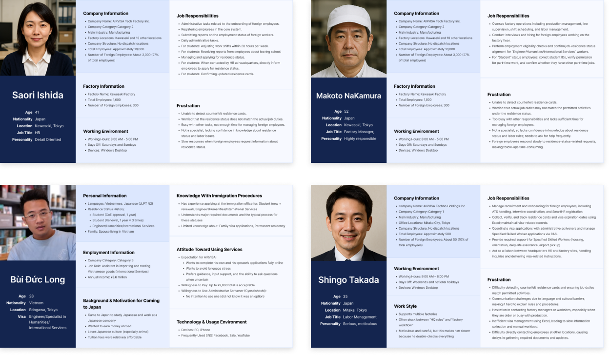
What Made These Personas Effective
We regularly reviewed and updated the personas to reflect new insights throughout the project.
Since visa applications occur repeatedly throughout a person’s life, we connected personas to key life events.
3. Context Scenarios
In addition to personas, I created context scenarios to describe the ideal visa management experience. By mapping users’ actions, thoughts, and emotions over time, these scenarios revealed real usage contexts and needs that personas alone could not capture.
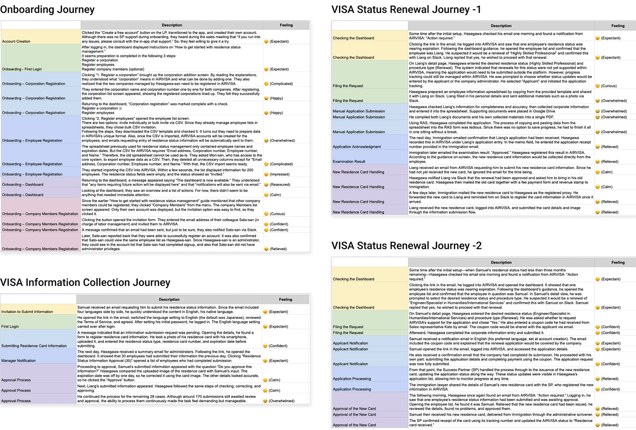
What Made the Scenarios Effective
At this stage, I intentionally set aside technical constraints. This allowed us to focus on the real value users needed, rather than limiting ideas too early.
4. User Flows
After aligning on the personas and defining the ideal experience, I collaborated with the PM and engineers to create user flows. At this stage, we determined which features should appear on each screen and the sequence in which users would complete their tasks.
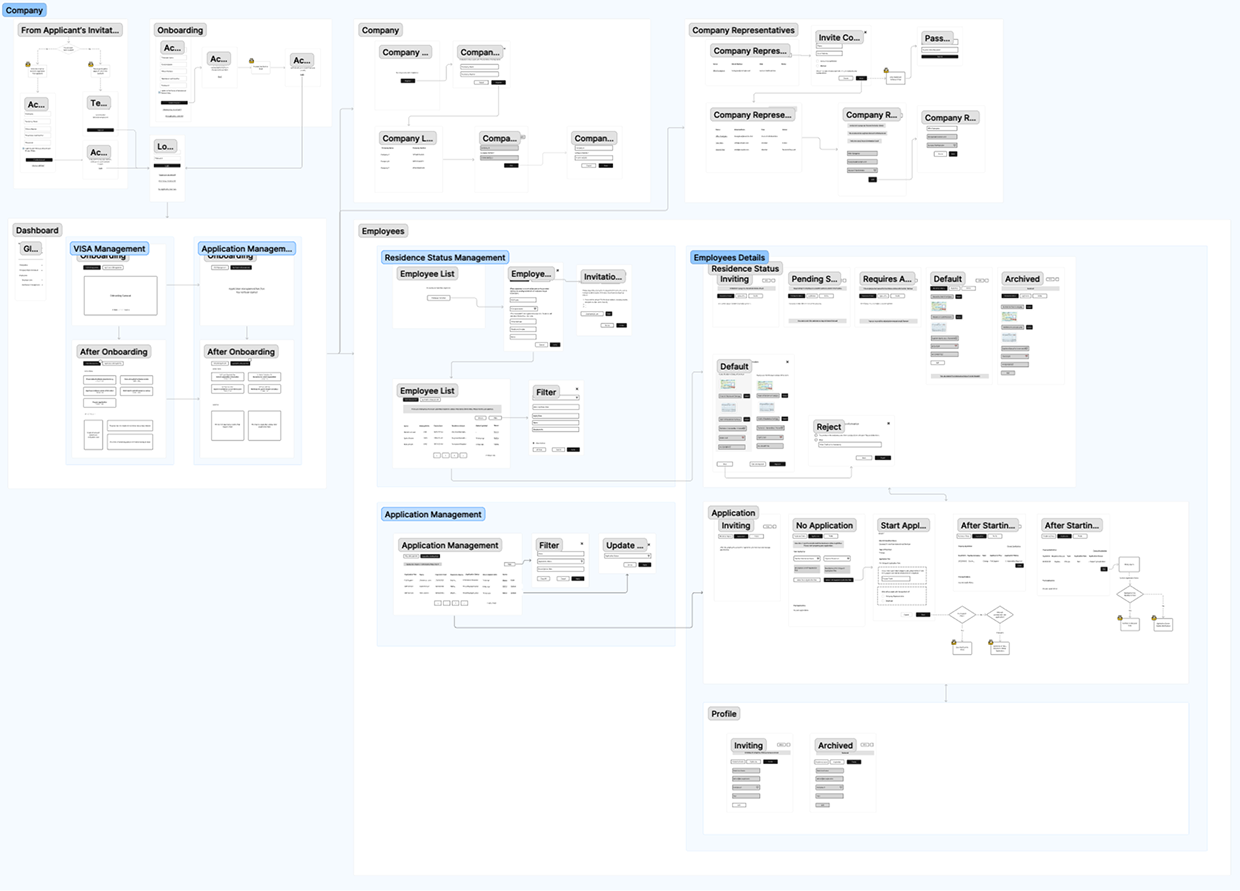
How I Addressed the Challenge
Visa management needed to integrate with various internal systems, leading to diverse HR workflows. To balance flexibility and clarity, we designed a core flow with adaptable branches, ensuring the experience remained intuitive.
5. Wireframing
Based on the user flows, I created low-fidelity wireframes to explore layout, information structure, and key interactions.
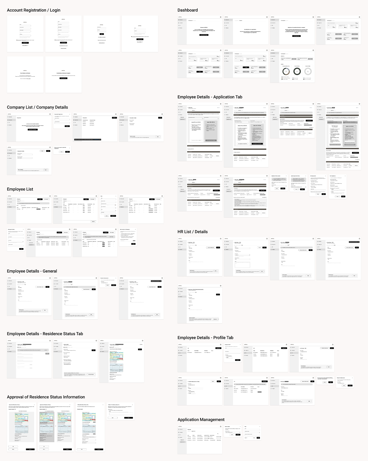
What Made the Wireframes Effective
Our users were experienced HR professionals, but not visa specialists. They had no intention of mastering the system. The design targeted a “permanent intermediate,” balancing clarity and efficiency.
Given the tight timeline, we conducted rapid internal reviews instead of formal usability testing. This allowed us to iterate quickly while balancing user experience and delivery constraints.
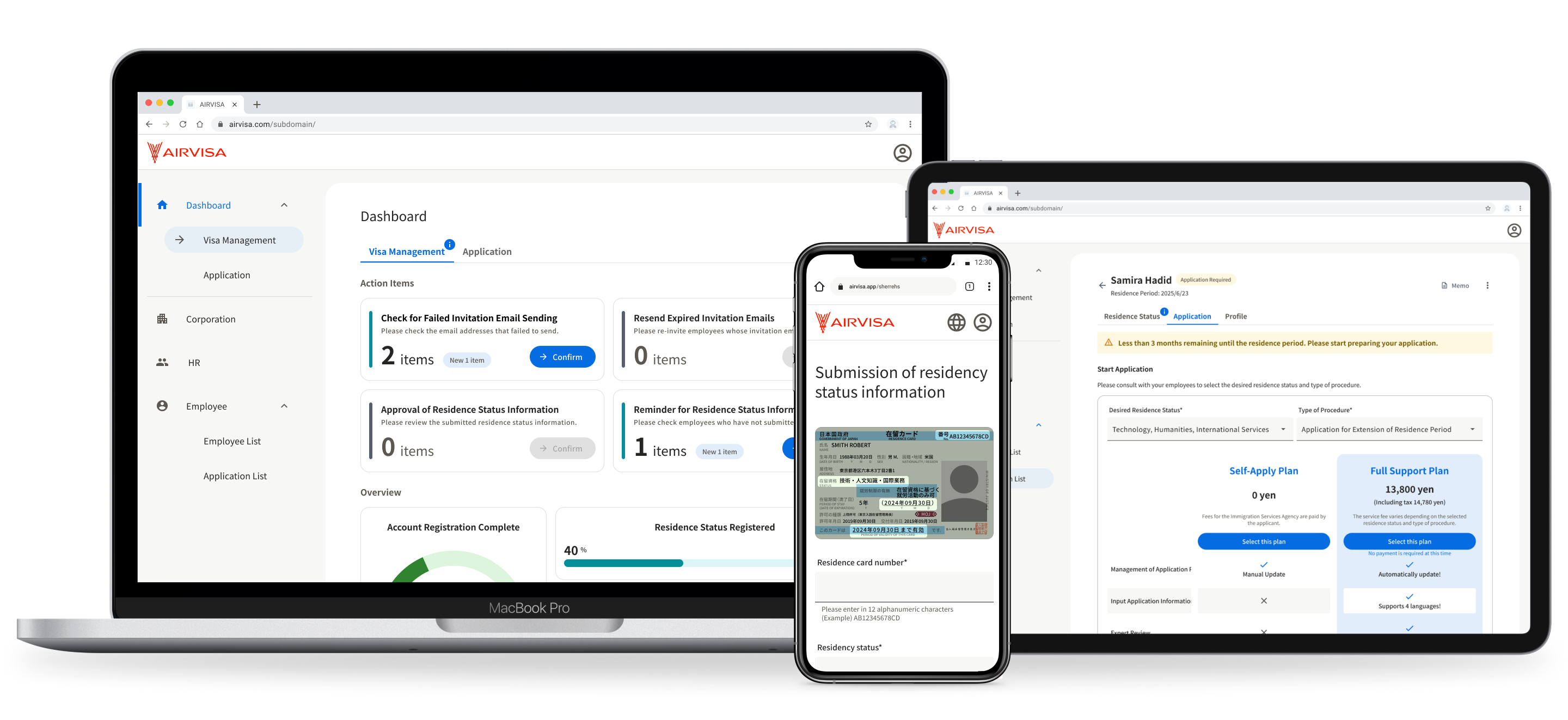
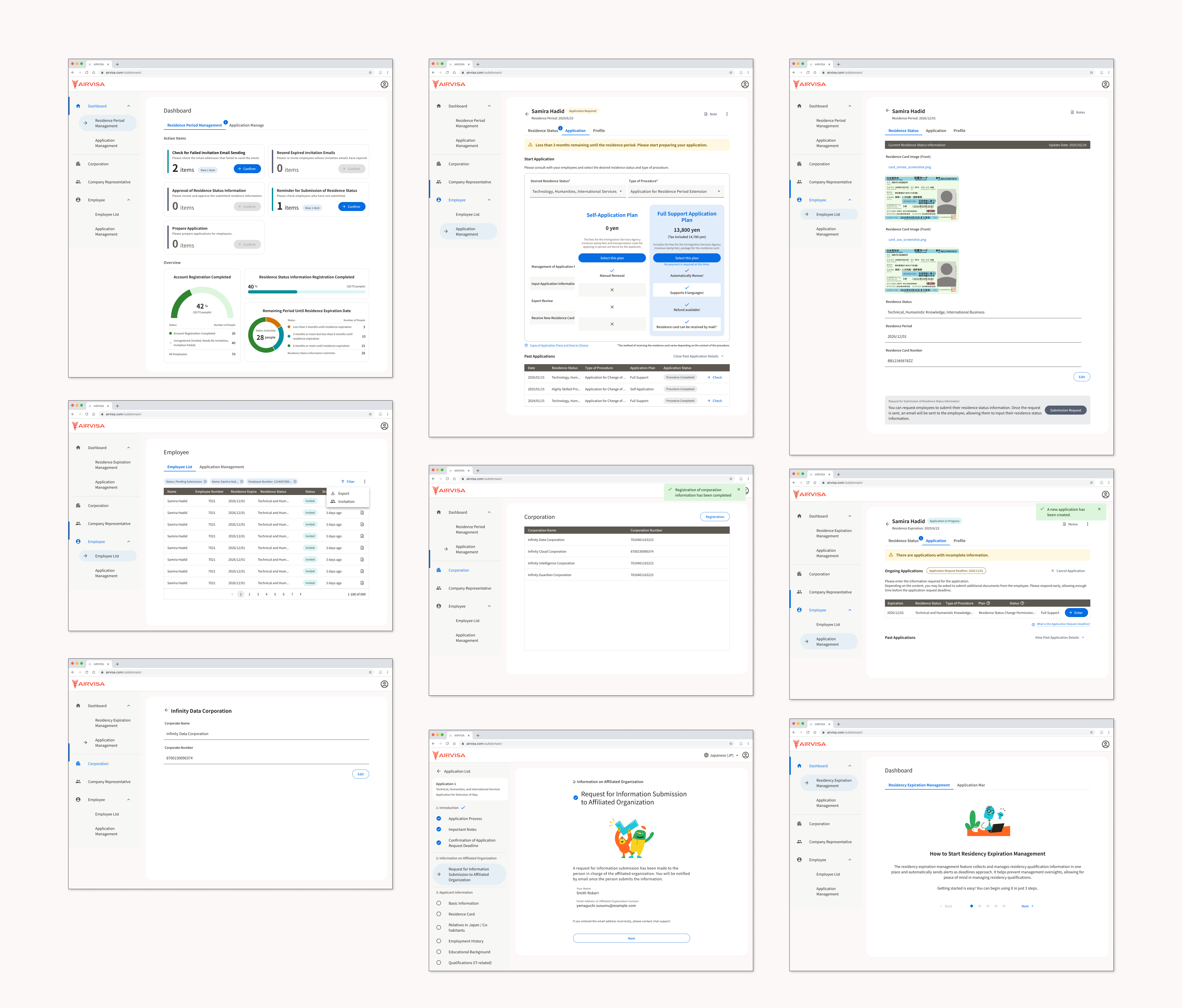
6. UI Design
Once the wireframes were finalized, I transitioned into visual design. I built the UI using the existing design system, introducing new components where necessary. The design was informed by user research insights — including user characteristics, work environments, and adoption contexts — which shaped the following design considerations:
Based on these considerations, I carefully defined visual hierarchy, component structure, alert prioritization, and color usage. The goal was to help HR professionals quickly identify critical information and complete tasks with minimal effort.
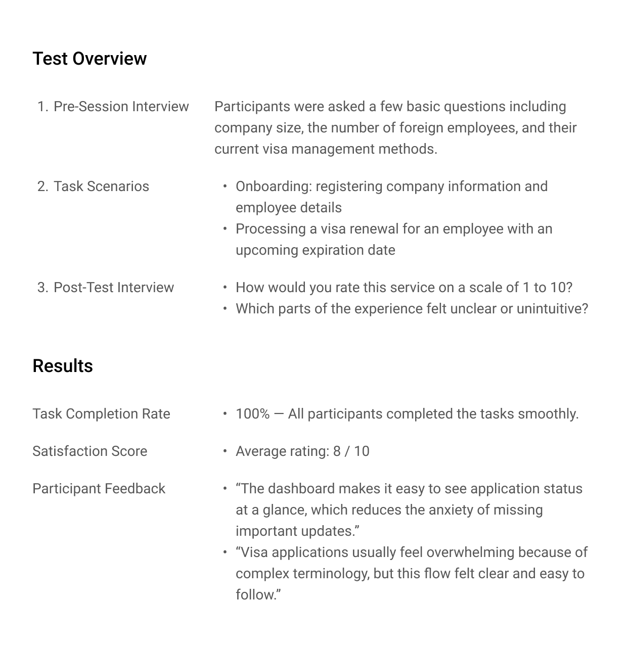
7. Usability Testing
Before launch, I conducted usability testing with eight participants using an interactive prototype to evaluate the design in realistic usage scenarios.
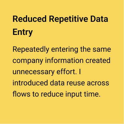
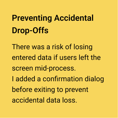
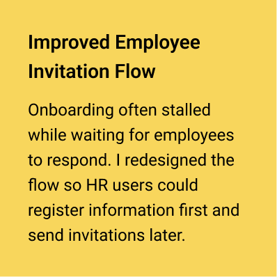
Based on key findings, I iterated on UI elements, interaction flows, and UX writing. These refinements significantly improved overall usability.
8. Design Handoff
To ensure a smooth and efficient implementation, I worked closely with engineers and stakeholders throughout the handoff phase.
Through daily stand-ups, I shared design progress with engineers. Since the system was technically complex, I shared designs early to gather feedback on constraints and iterated accordingly, ensuring a smooth handoff to development.
I added clear annotations in Figma to explain specifications and design decisions, helping reduce misunderstandings during development.
In weekly company-wide reviews, I presented interactive prototypes to stakeholders and gathered feedback, clearly explaining the rationale behind key decisions and incorporating cross-functional perspectives.
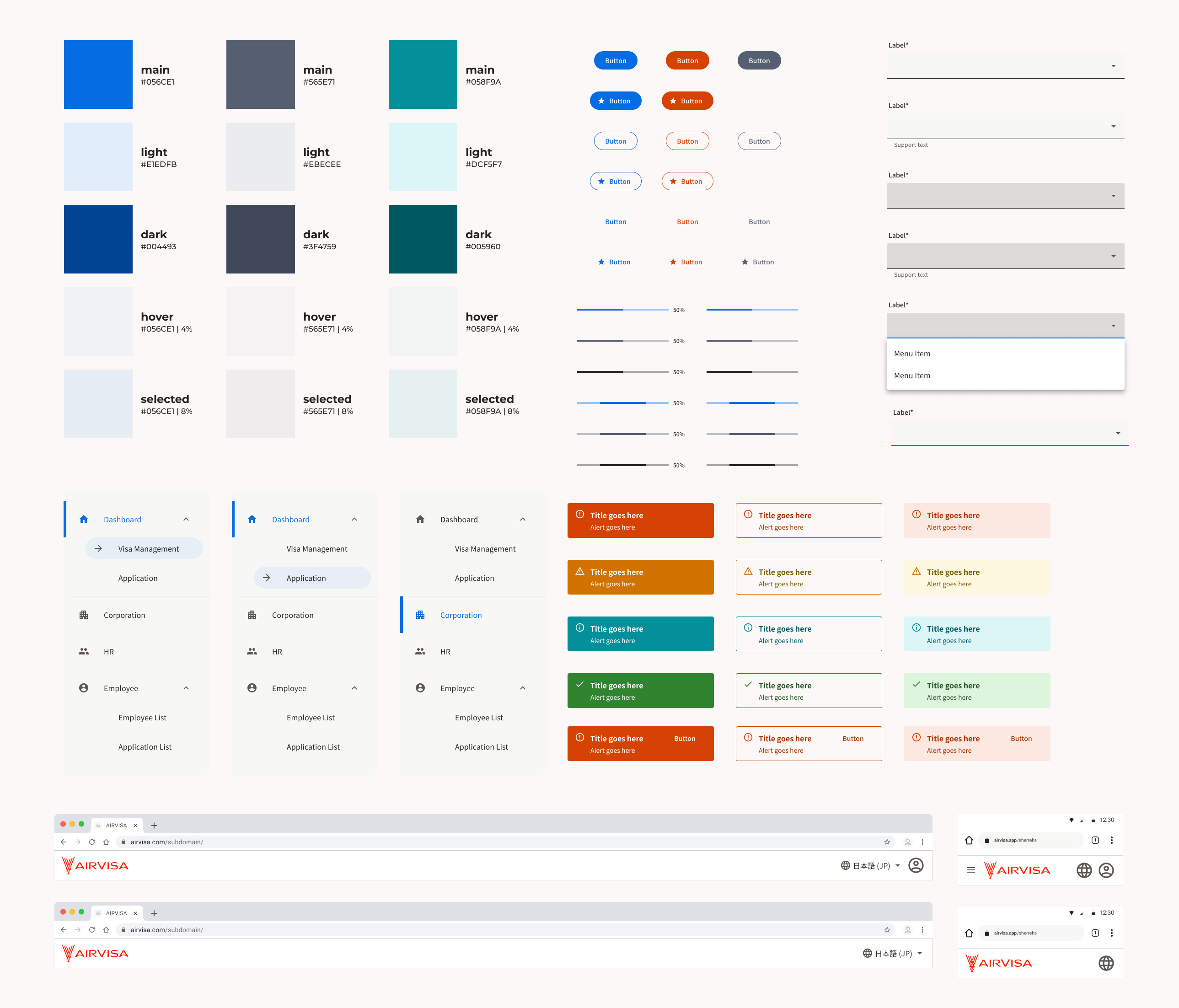
Design System
In this project, I actively leveraged and extended the existing design system, which we had originally built from scratch. It started small and evolved as new product needs emerged.
The foundation was based on Material Design 3. Despite limited resources, the system enabled us to maintain consistency and quality across the product.
The current design system includes: Logo / Color / Typography / Icon / Illustration / Component Library
Outcomes
As a result of these design efforts, the product exceeded its business goals and achieved high user satisfaction.
Although visa management is a highly regulated and complex domain, deep user understanding and continuous validation enabled us to deliver both strong business outcomes and a positive user experience.